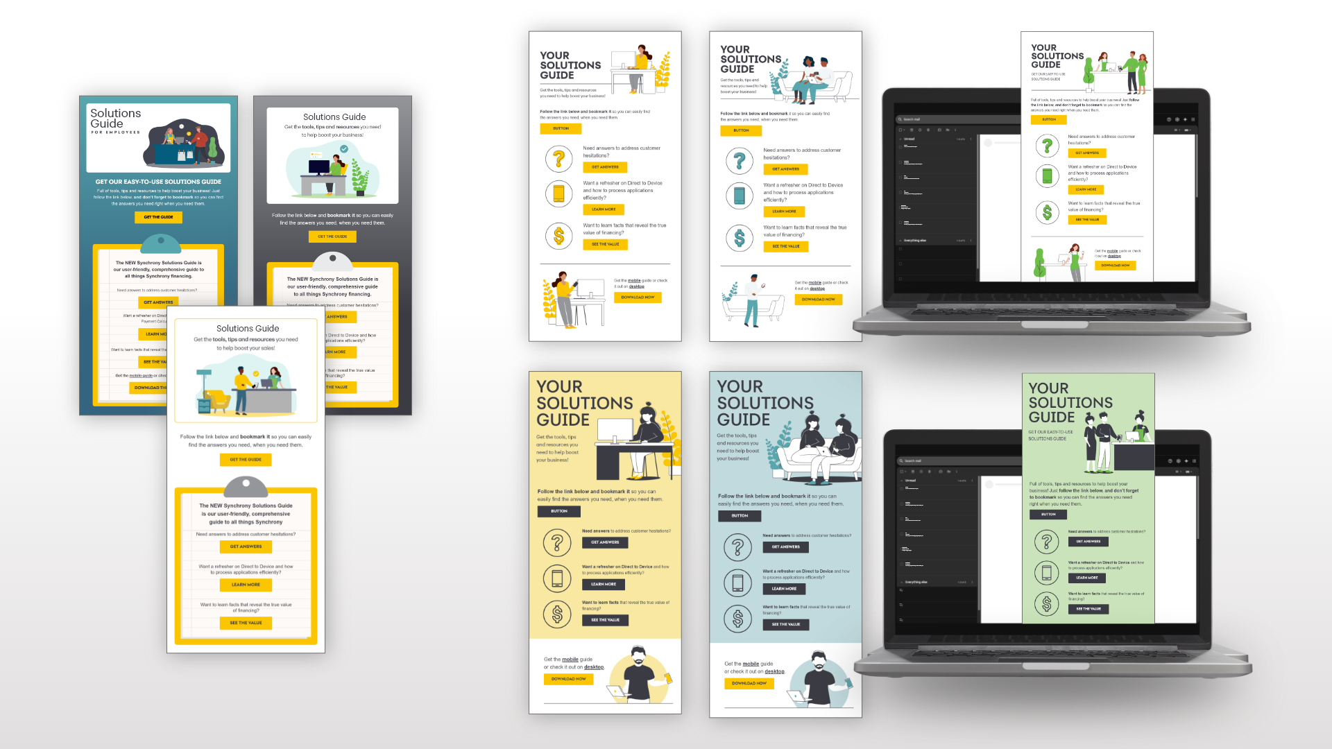
The Ask: the black, blue and white email series (left below) was created previously, but the client was hesitant and requested a new look for the same series.
The Goal: provide an updated look to the brands illustrative style. Being strategic with color to easily identify specifics audience while using it intentionally within the separate illustrative scenes.
The Results: two options of illustrative style that use three specific colors from the clients brand to identify their Merchant, Associate and HOME audiences. Option one shows a clean black and white outline style with pops of color on people, plants and pets. Drawing attention to the different lives of the clients audiences. Option two utilizes the clients secondary palette bringing in floods of pastel backgrounds. The illustrative style is a push on the clients standards but the simple black and white design allows the style to stand out versus competing with a fully colored scene. The client was extremely delighted with the results, deciding to run both options for A/B testing.
Previous Design
Redesign